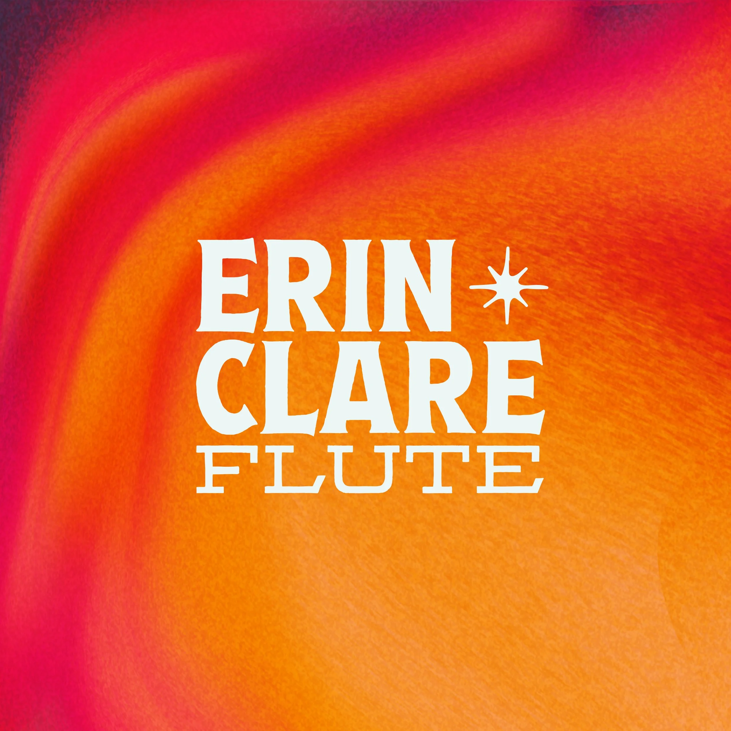
Brand Identity | Erin Clare Flute
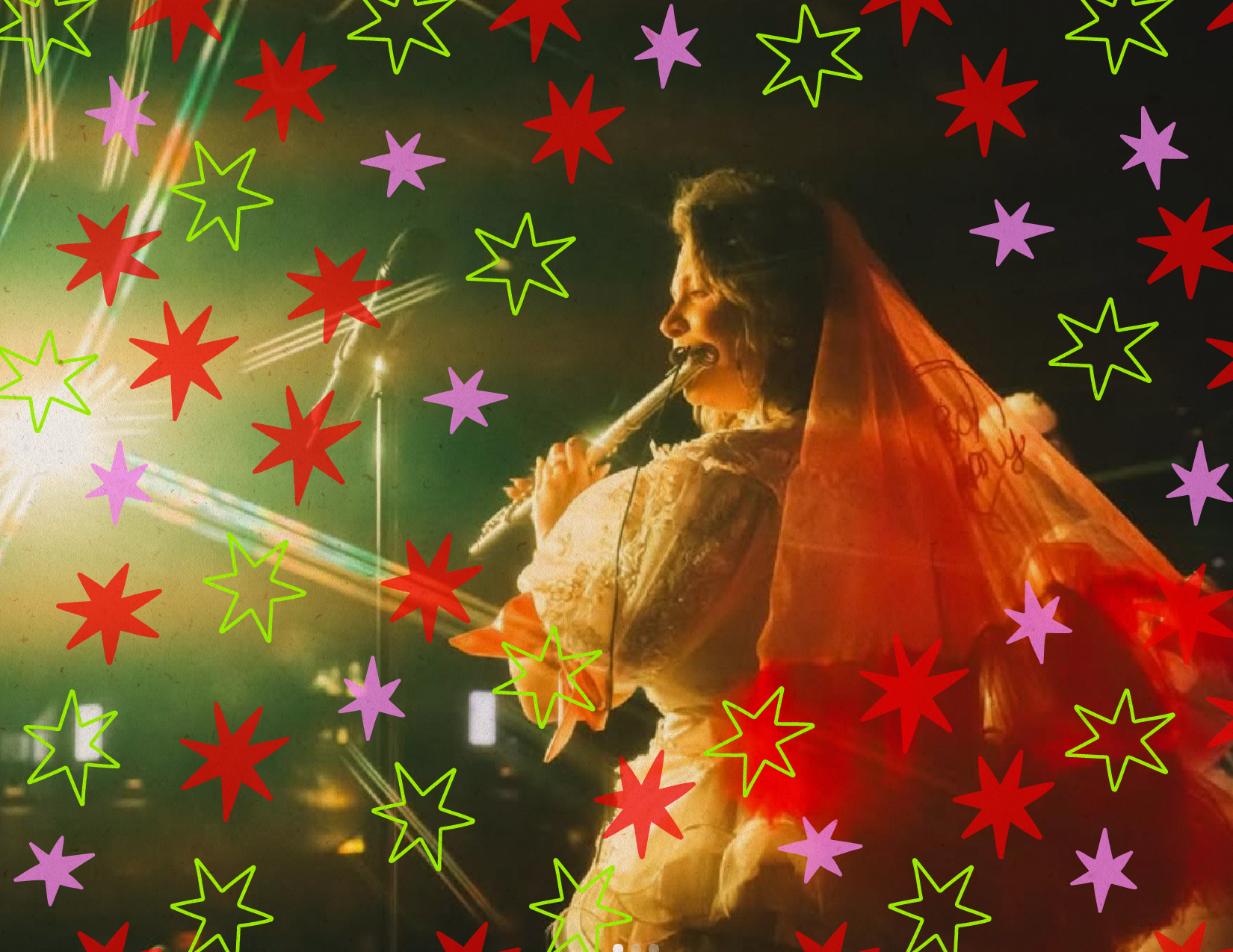
Erin Clare was building momentum in Nashville—playing more shows, reaching new audiences, and finding her footing in a competitive music scene. She needed a new, memorable identity design that reflected her artistry.
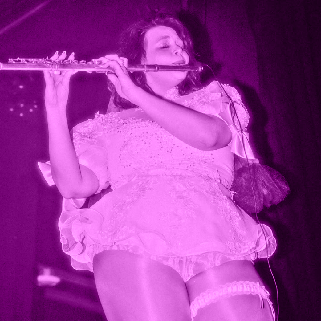
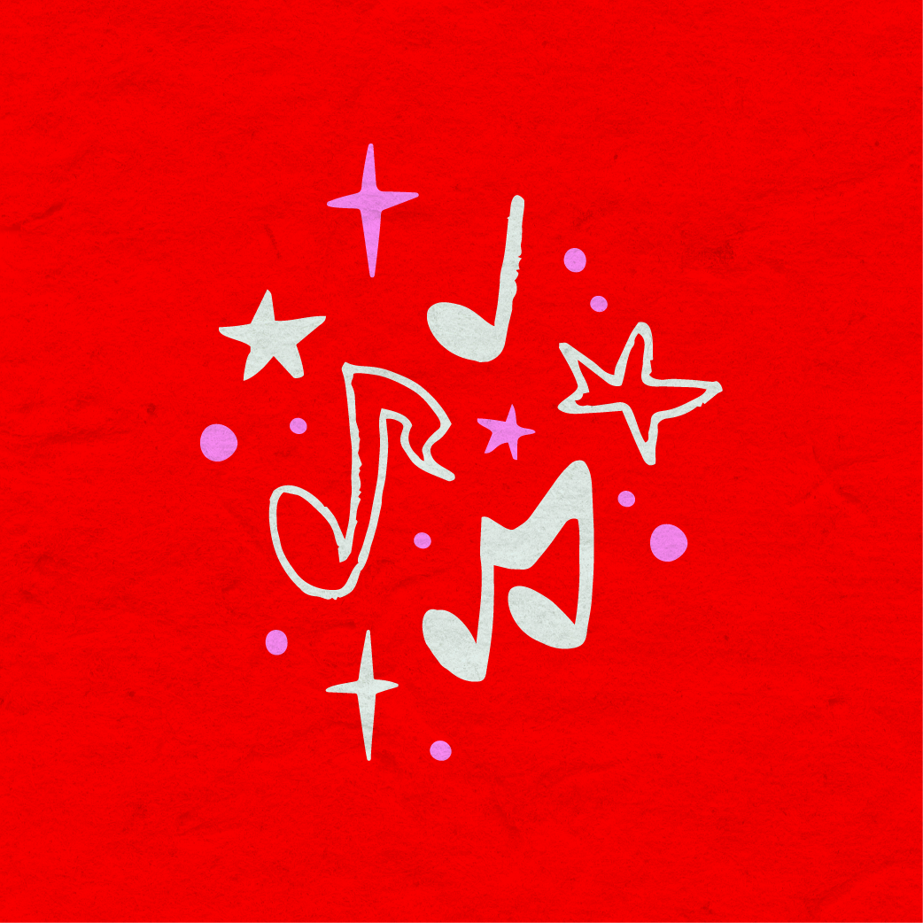
The system extends across the pieces she uses most—show materials, social, and merchandise—so it stays consistent wherever it shows up.
The result is a distinct, memorable identity that gives her a strong presence as she continues to grow her audience in Nashville.”
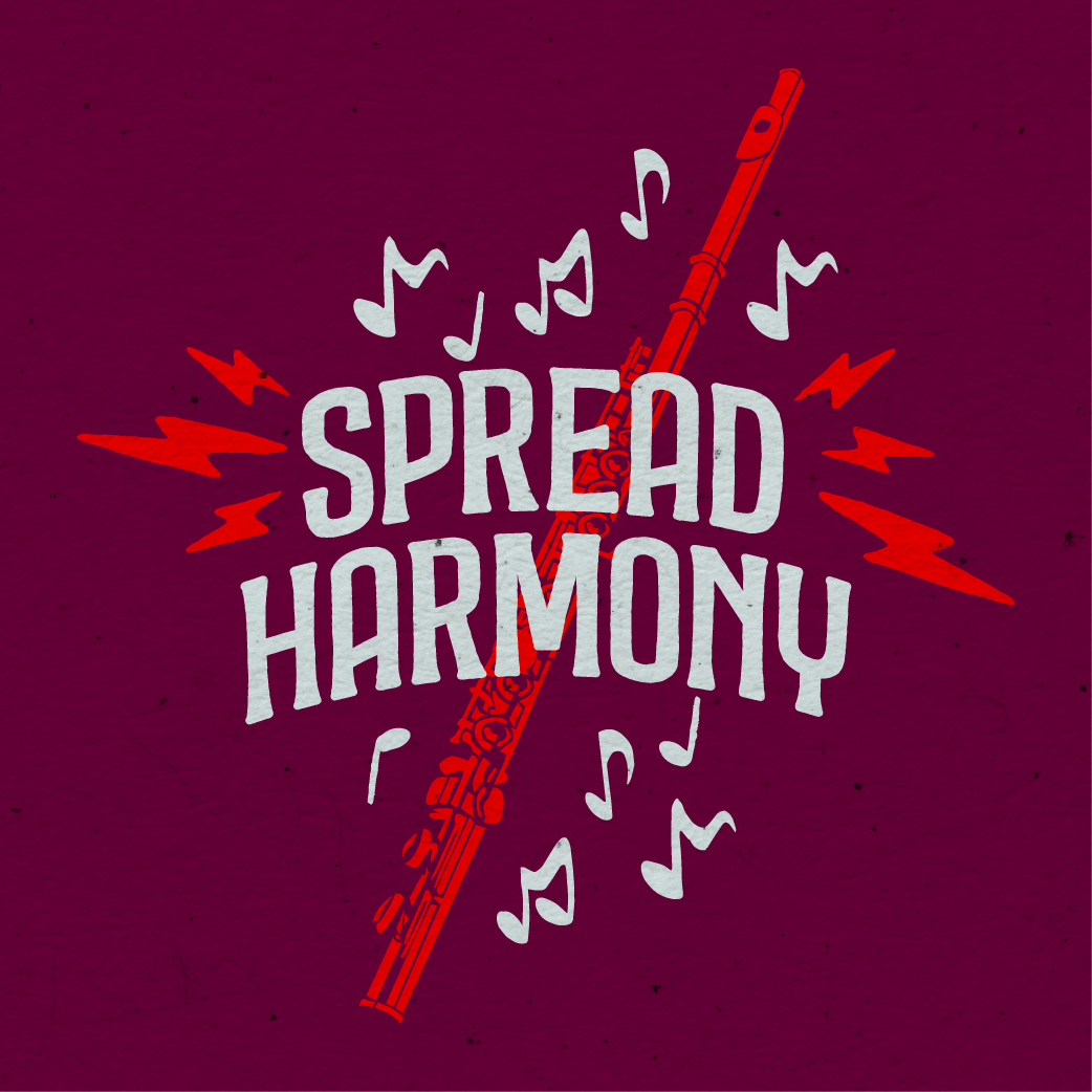


The focus was on creating something recognizable and true to her—capturing the energy of her live sets, her ‘rock flute’ sound, and her eclectic, feminine style.
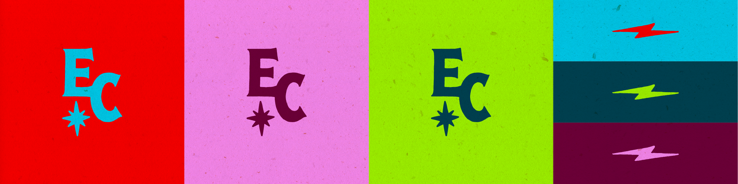
This included logo design, typography, color, and a set of supporting graphic elements that translate the energy of her performances into a visual language.