Integrated Campaign | American Hospital Association
Recent emergencies - from pandemics to natural disasters - have exposed gaps in coordination across healthcare and public safety agencies. The American Hospital Association (AHA) set out to define a more unified, national approach to emergency preparedness.

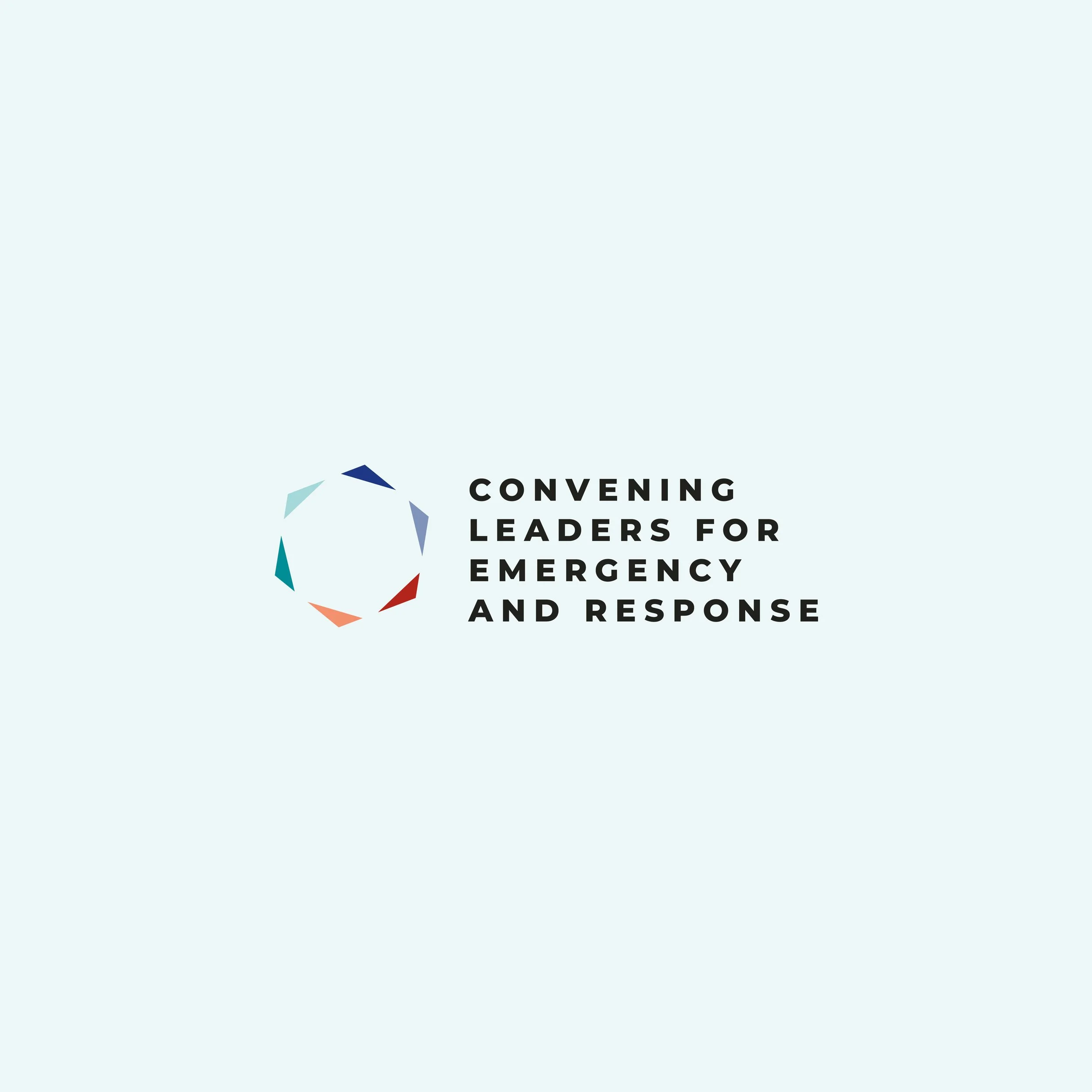
Working closely with AHA, we supported the CLEAR initiative from early development through rollout. As content was being developed, I led the creation of a new visual identity - including logo, color, typography, and overall art direction - establishing a foundation designed to scale across a broad, national network of stakeholders.
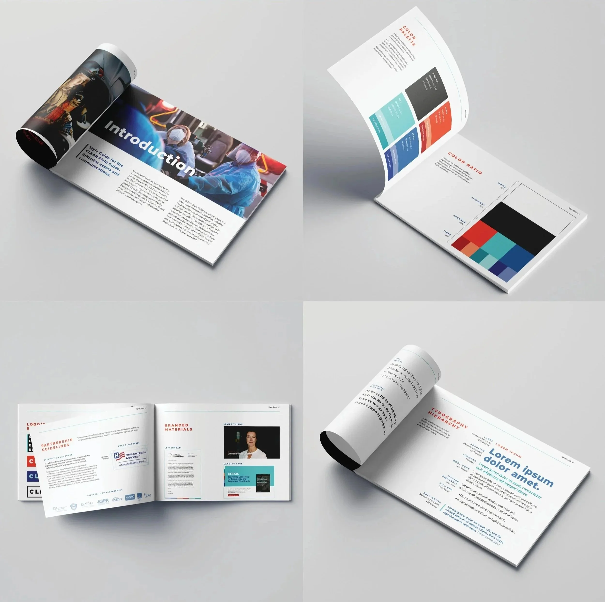
With that system in place, I designed the CLEAR Field Guide, translating complex, cross-sector strategies into a clear, structured, and highly navigable resource built for real-world use.
To support national rollout, we extended the system into a full suite of materials - including presentation decks for in-person trainings and social content - ensuring the visual language scaled consistently across touchpoints while driving adoption.