Rebrand & Integrated Campaign | Salinas Valley Health
After years with the same identity, Salinas Valley Memorial Healthcare System needed a brand that felt more current, easier to navigate, and more in step with the community it serves
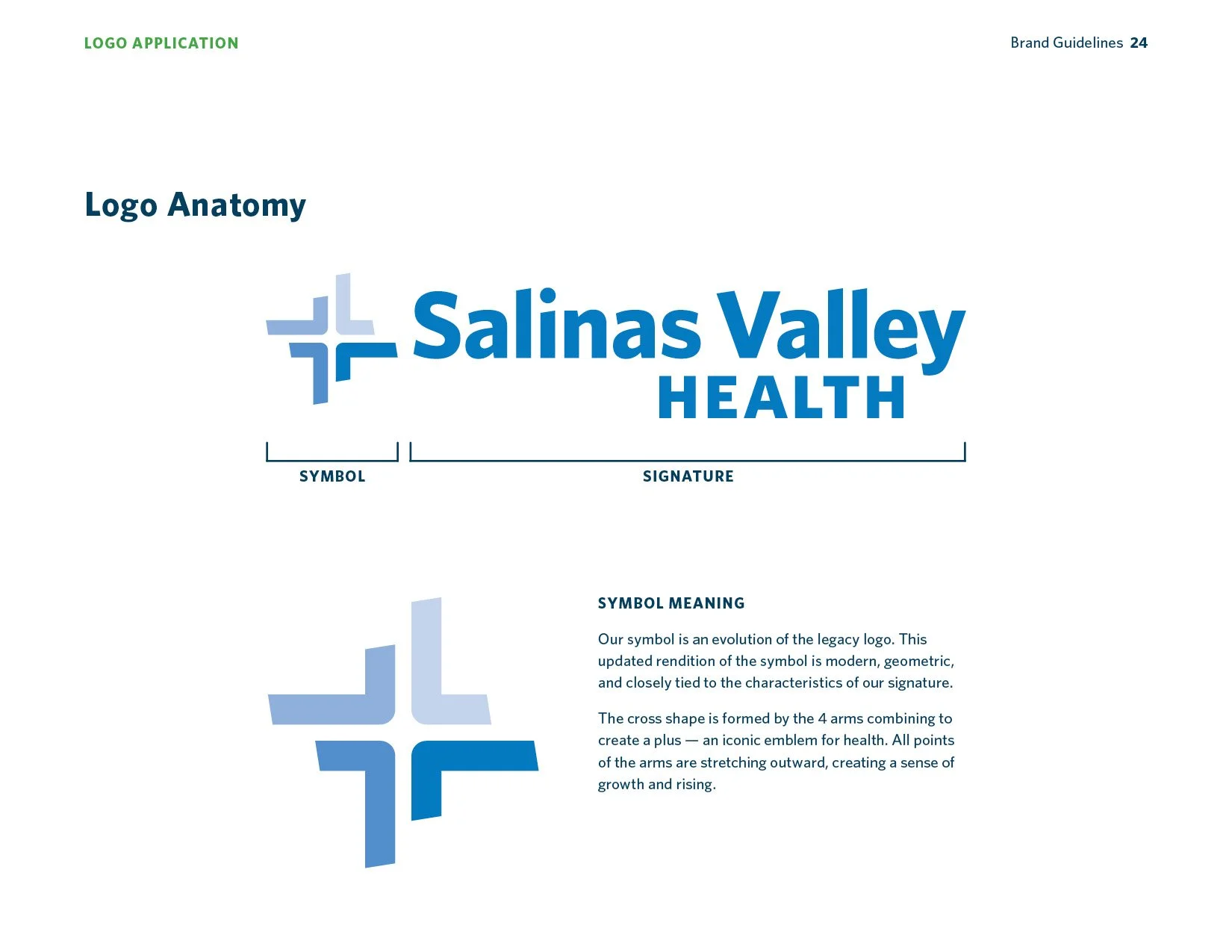
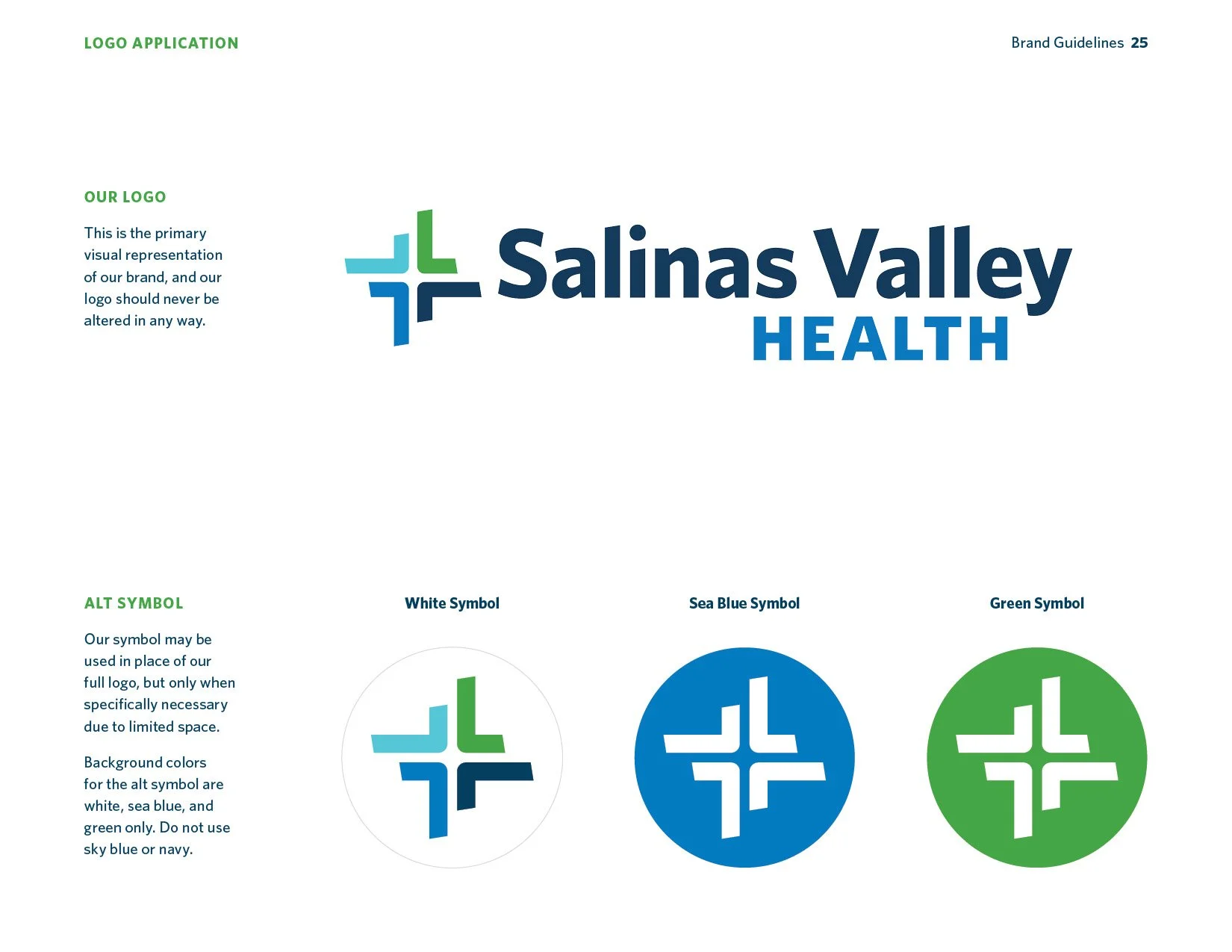
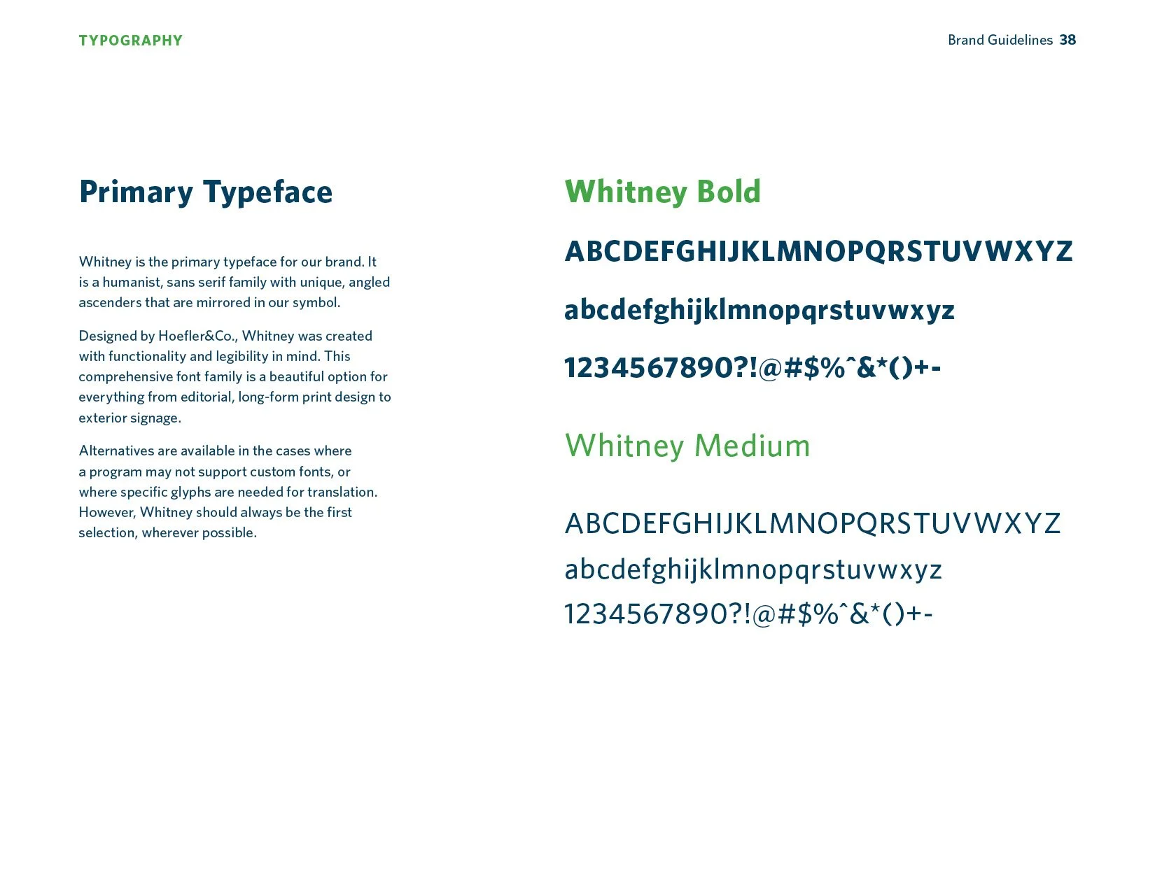
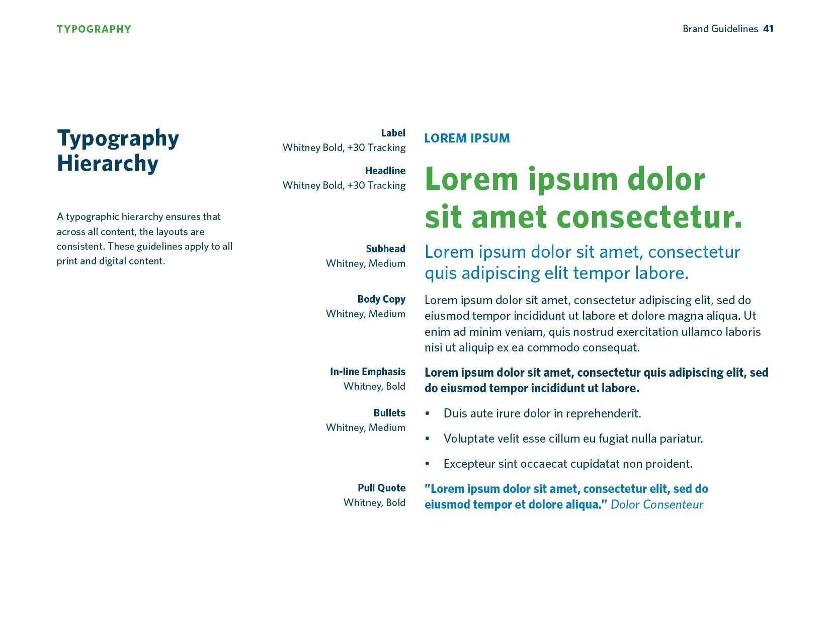
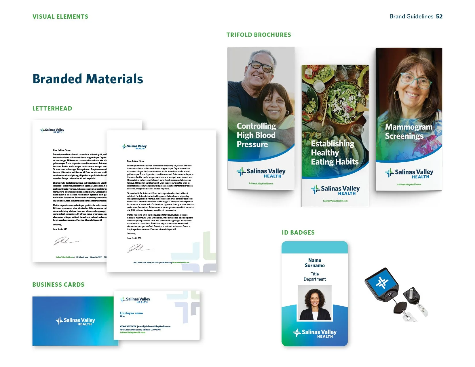
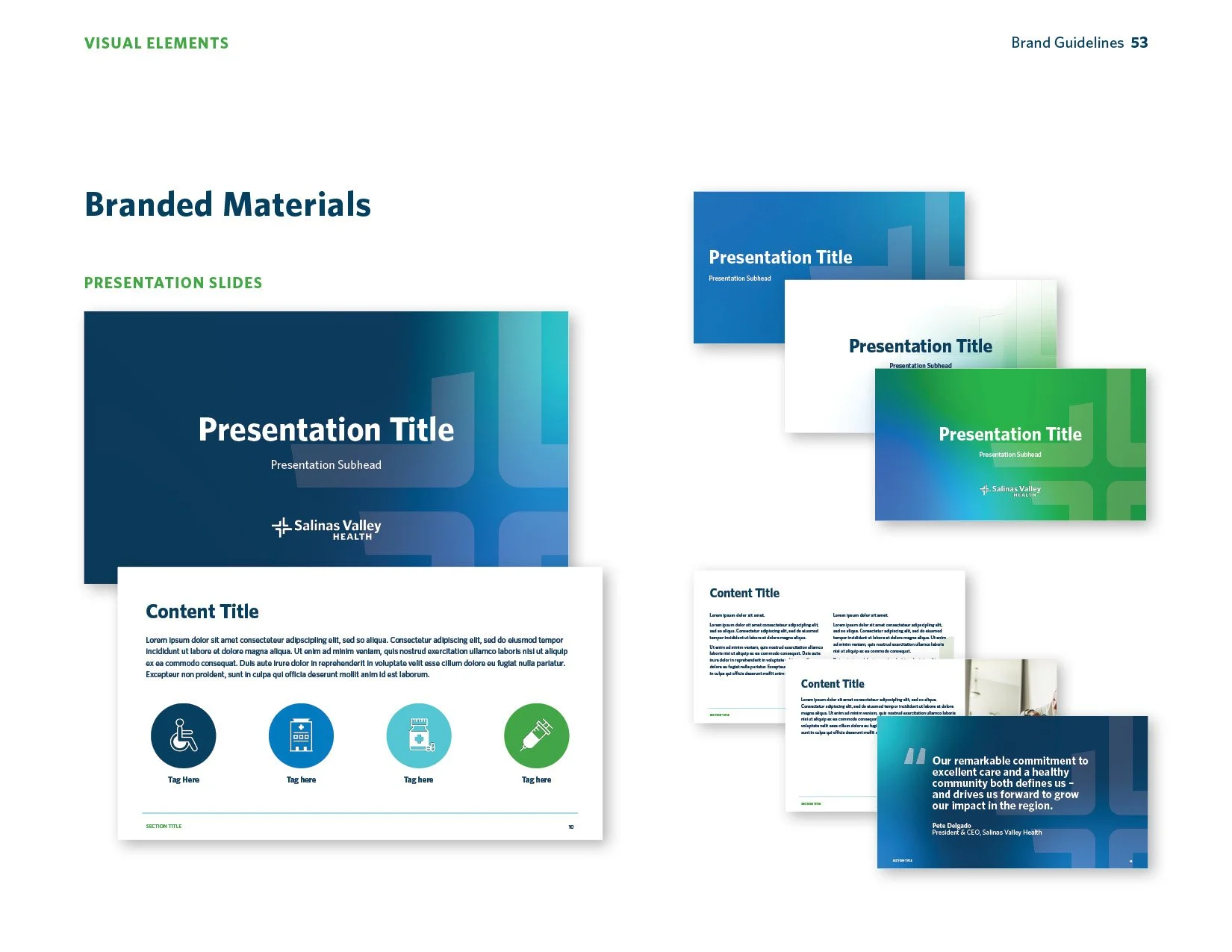
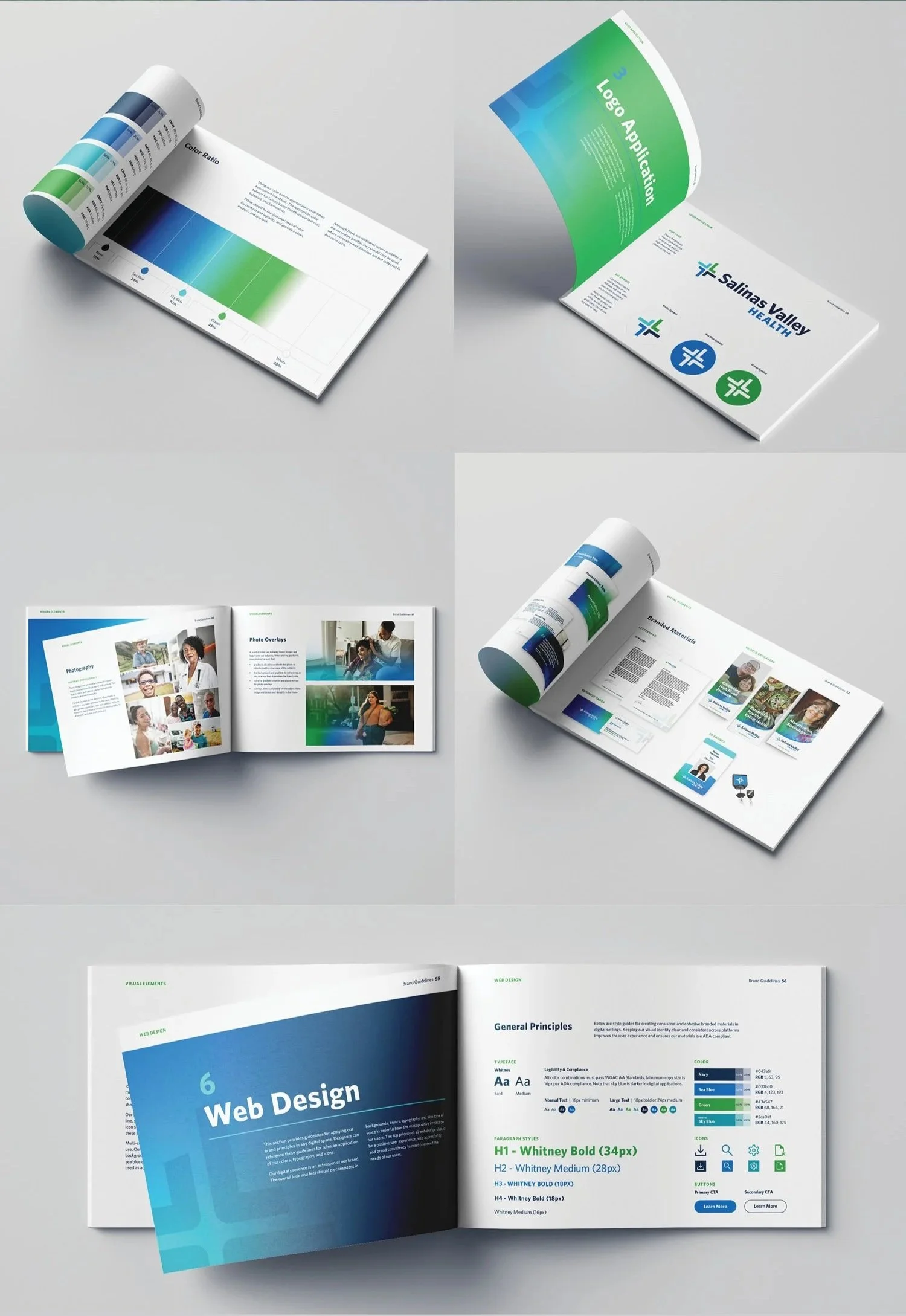
After years with the same identity, Salinas Valley Health had outgrown its brand. As lead designer, I led the work from early concepts through launch, developing the full identity system—logo, color, typography, and supporting visuals.
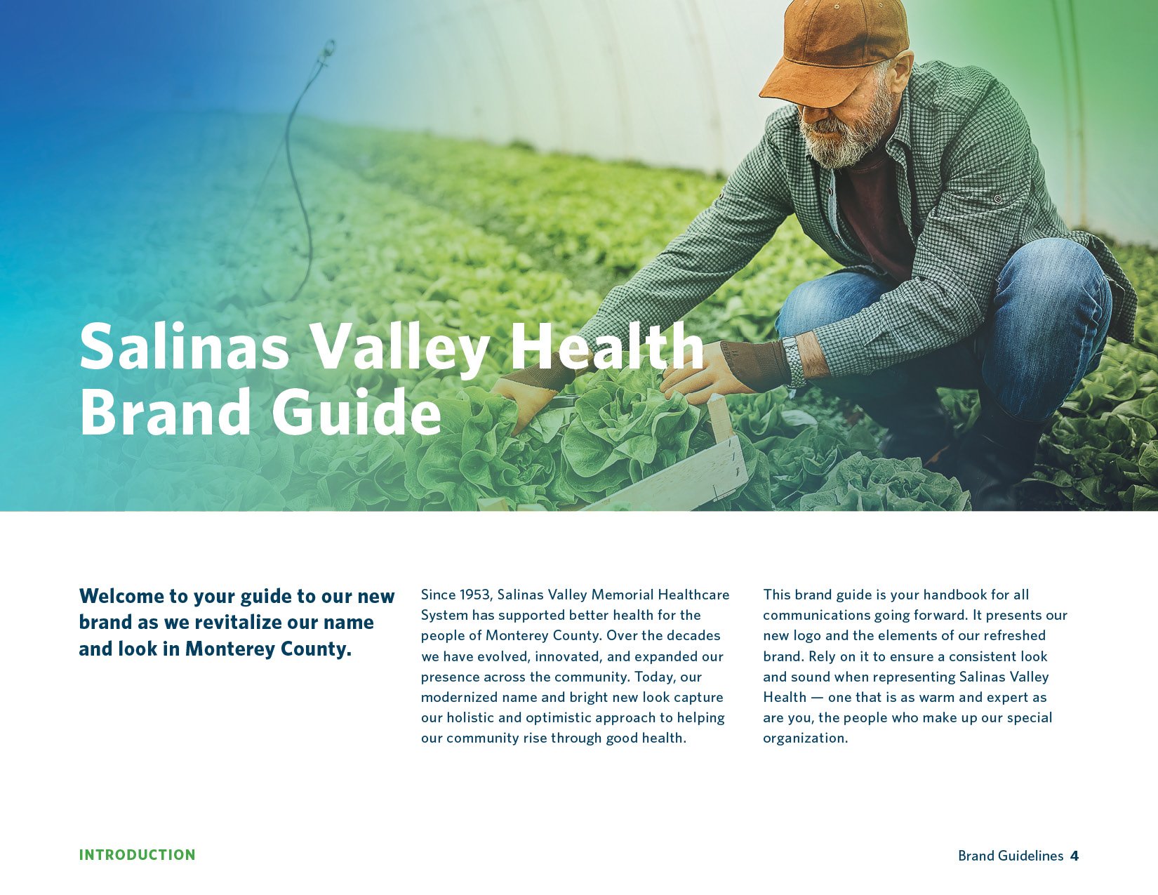
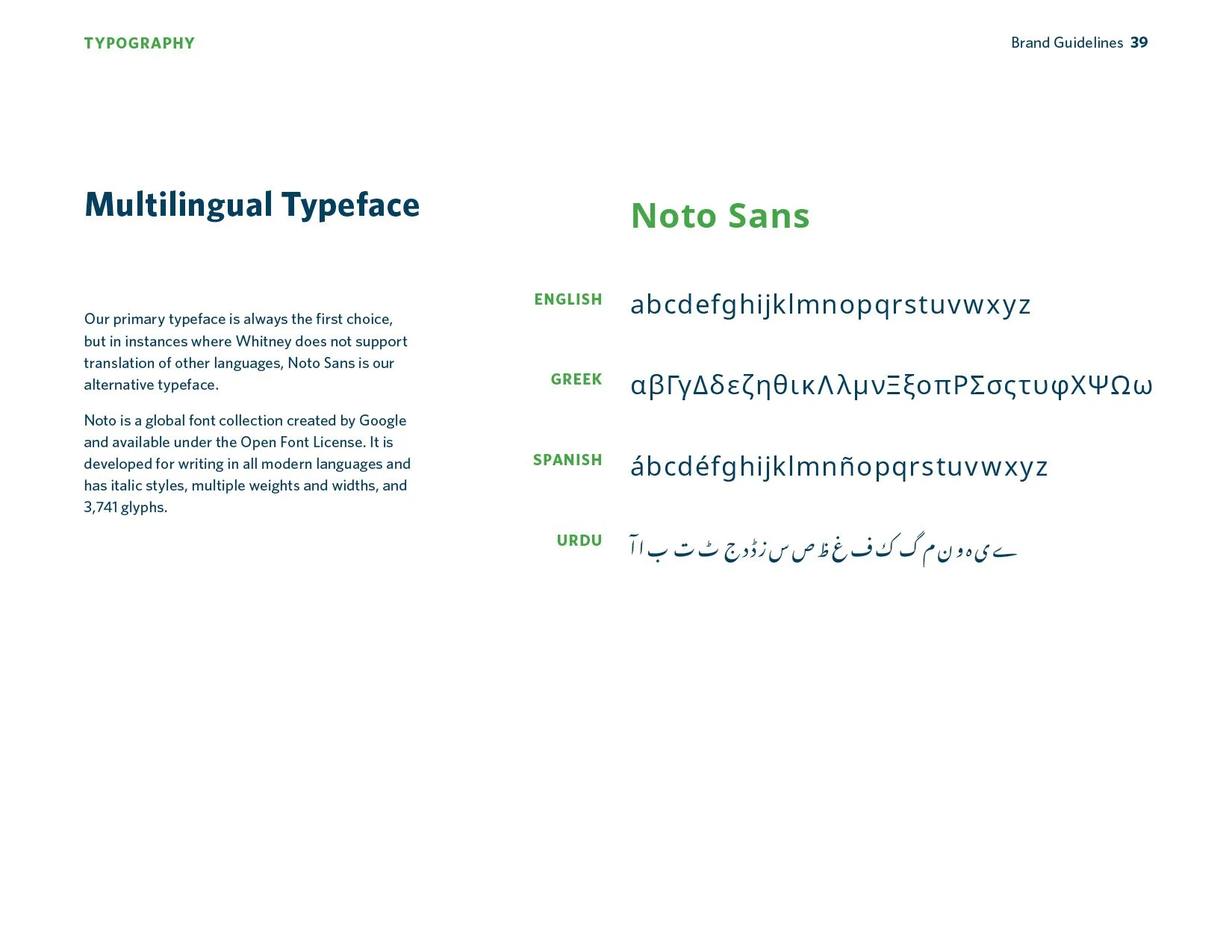
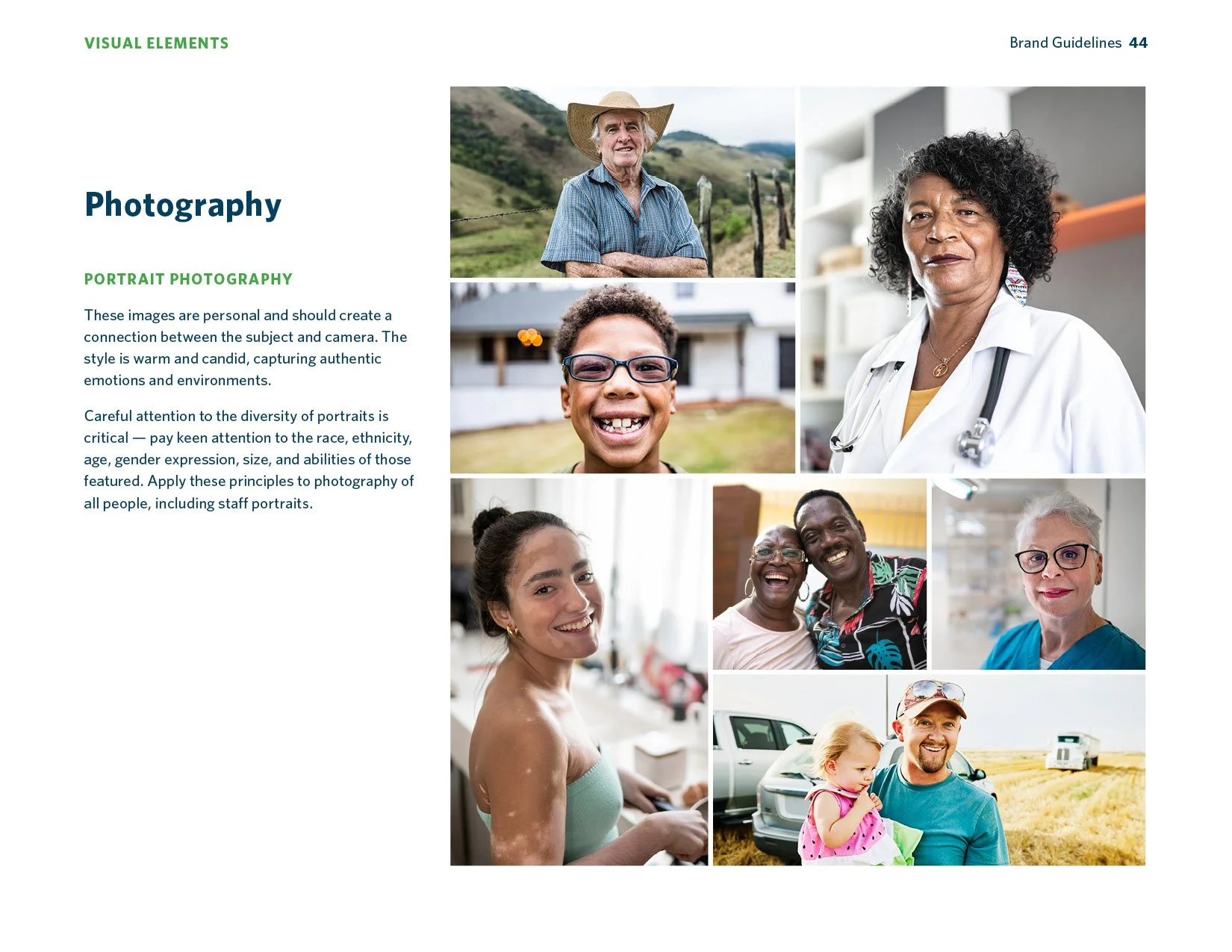
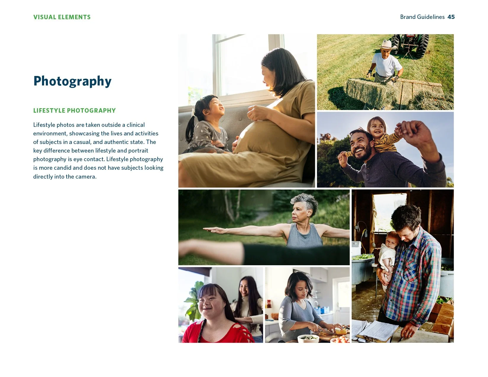
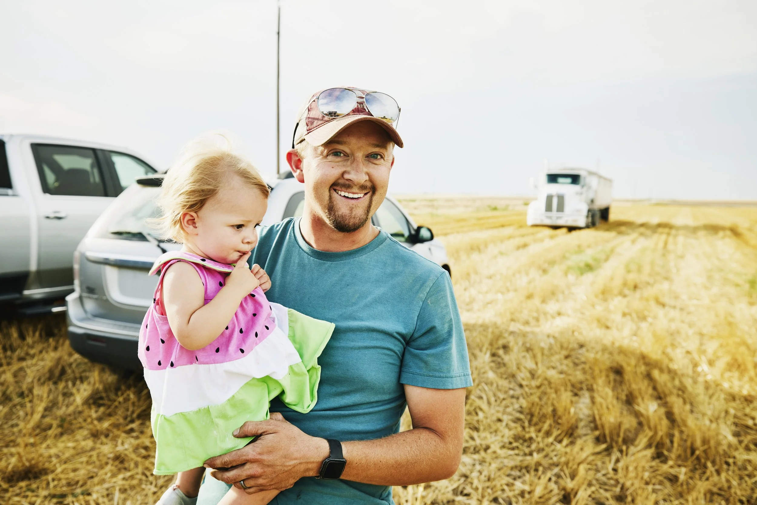
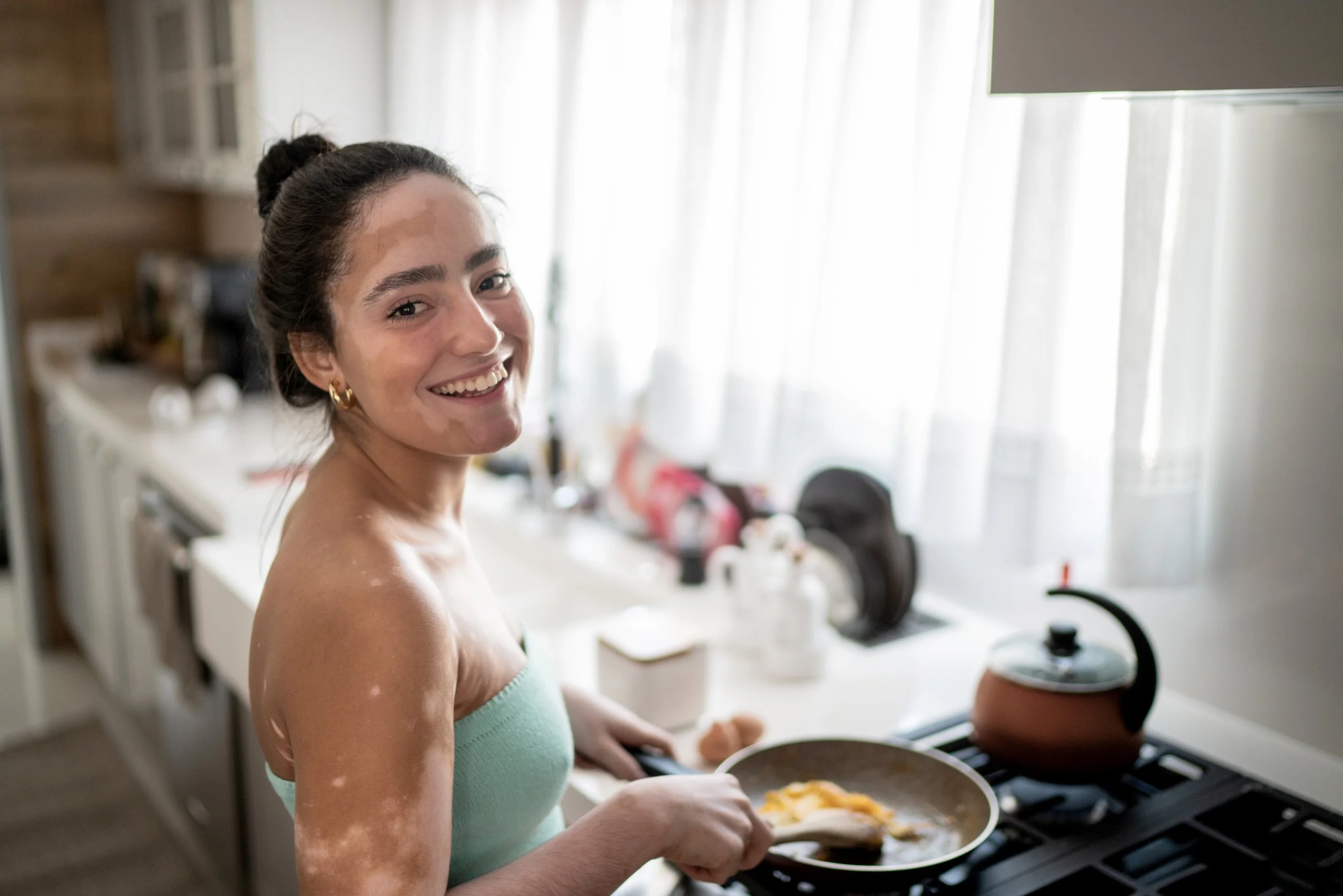
The brand draws from the Salinas Valley itself—an agricultural region known as the ‘salad bowl of the world’ for producing much of the world’s leafy greens. Surrounded by mountains with the Pacific just beyond the hills, the landscape became a key influence on the visual language. The region is also majority Spanish-speaking, with a large Hispanic population and deep roots in farming—context that shaped how the brand looks and how it communicates.
From the start, the brand was developed to work across both English and Spanish. This wasn’t approached as a simple translation, but as a true transcreation - ensuring the tone, clarity, and visual language carried consistently and clearly.


We also led development of the organization’s first TV spot—guiding the art direction, on-site shoot, and post-production. Our commercial went on to earn a Gold Award at the HCIC Digital Health Awards.