Rebrand | Gillette Children’s
Gillette Children’s had been a leader in pediatric care for more than 125 years. But their brand didn’t reflect that reality. It needed to balance both sides of who they are: world-class specialists, and a place guided by the spirit of the kids they care for.

I worked closely with the team at Gillette Children’s to lead a full rebrand, translating their newly defined vision, mission, and values into a unified visual and verbal system. The challenge was finding the right balance—capturing the individuality and spirit of the kids they serve without downplaying the complexity of their care or the depth of expertise behind it.
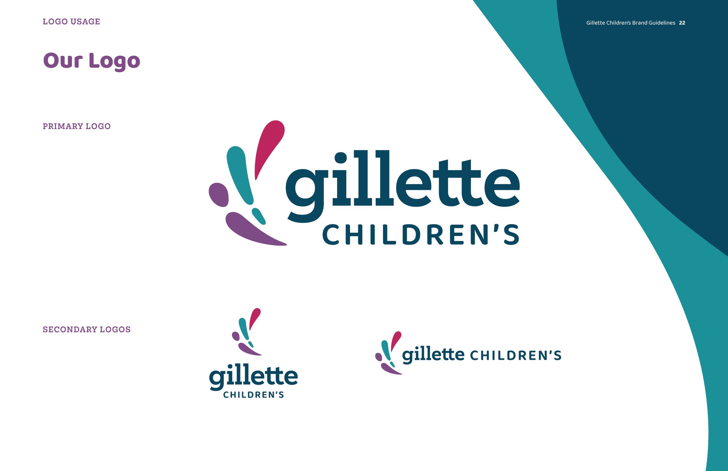
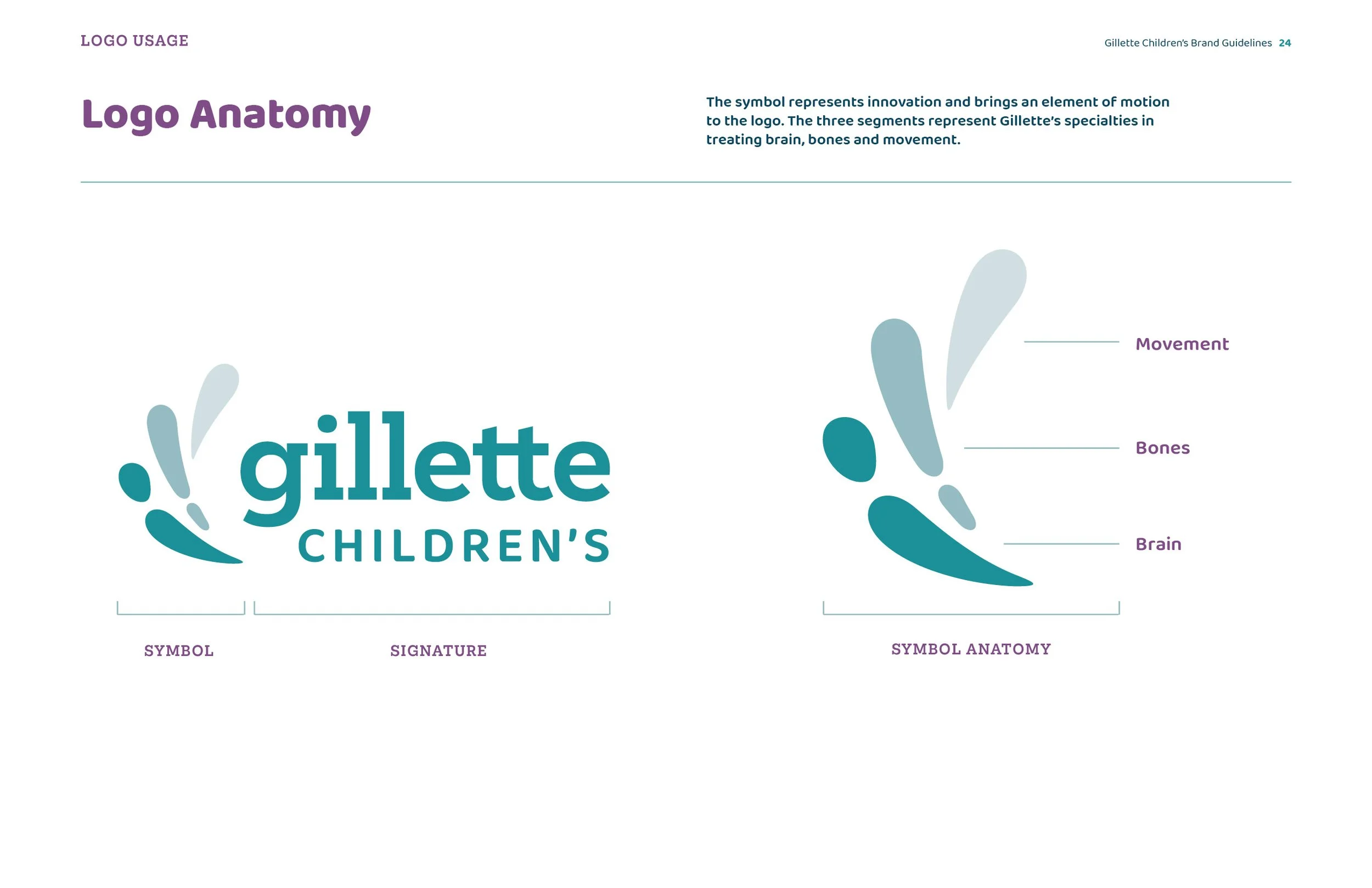
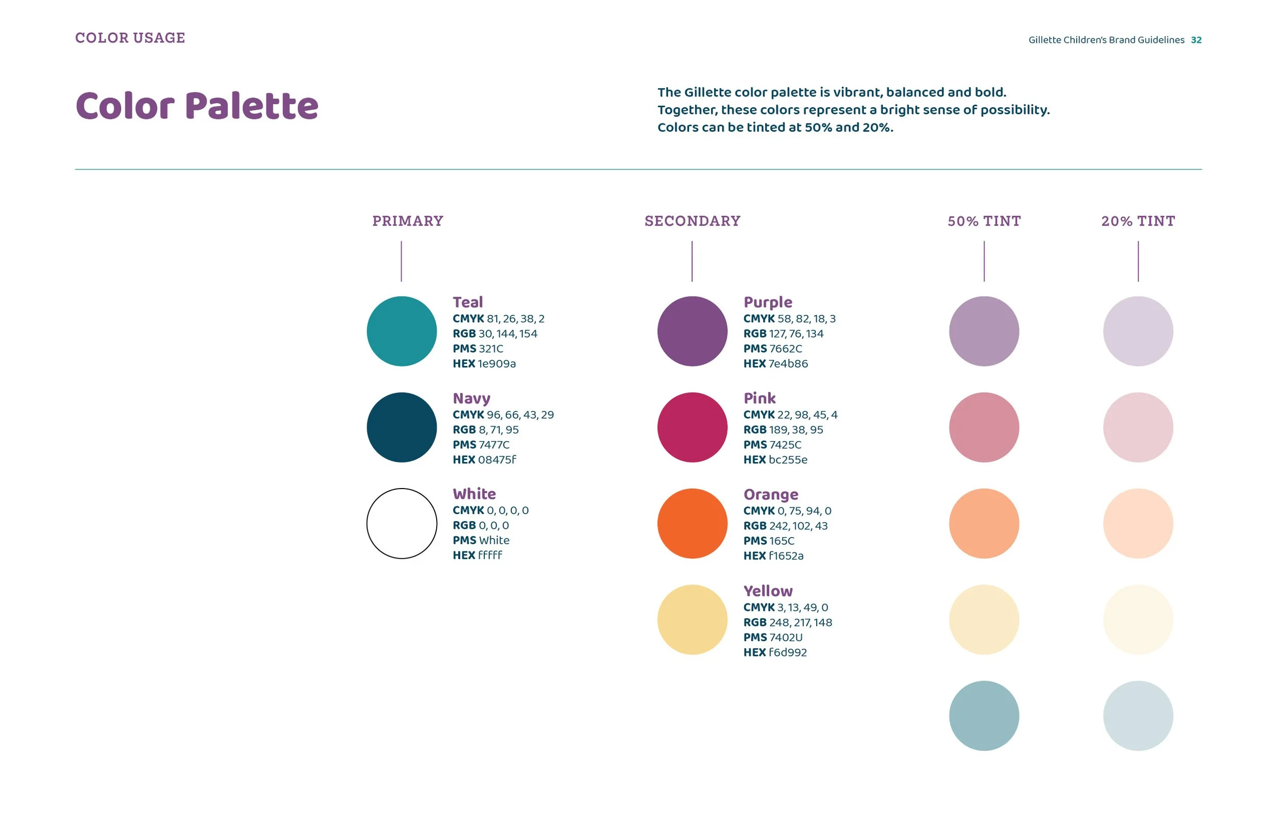
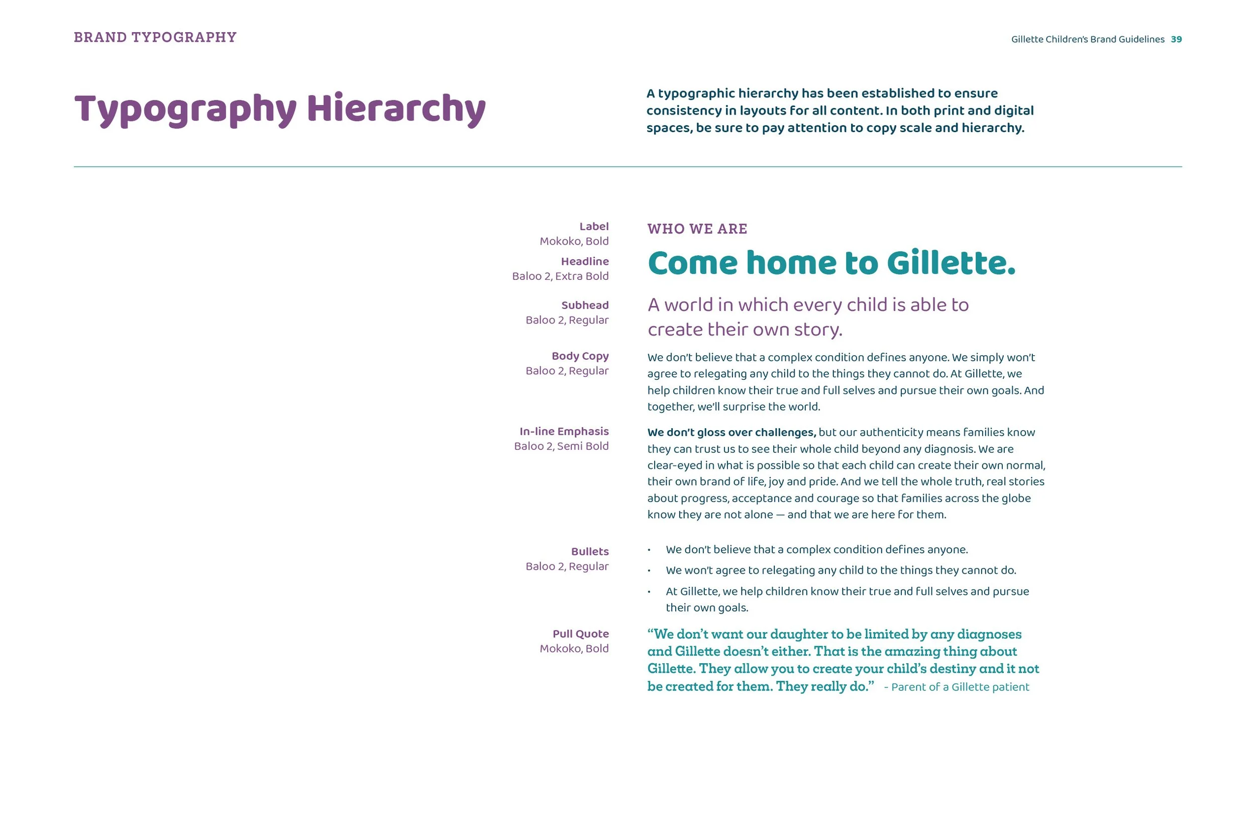
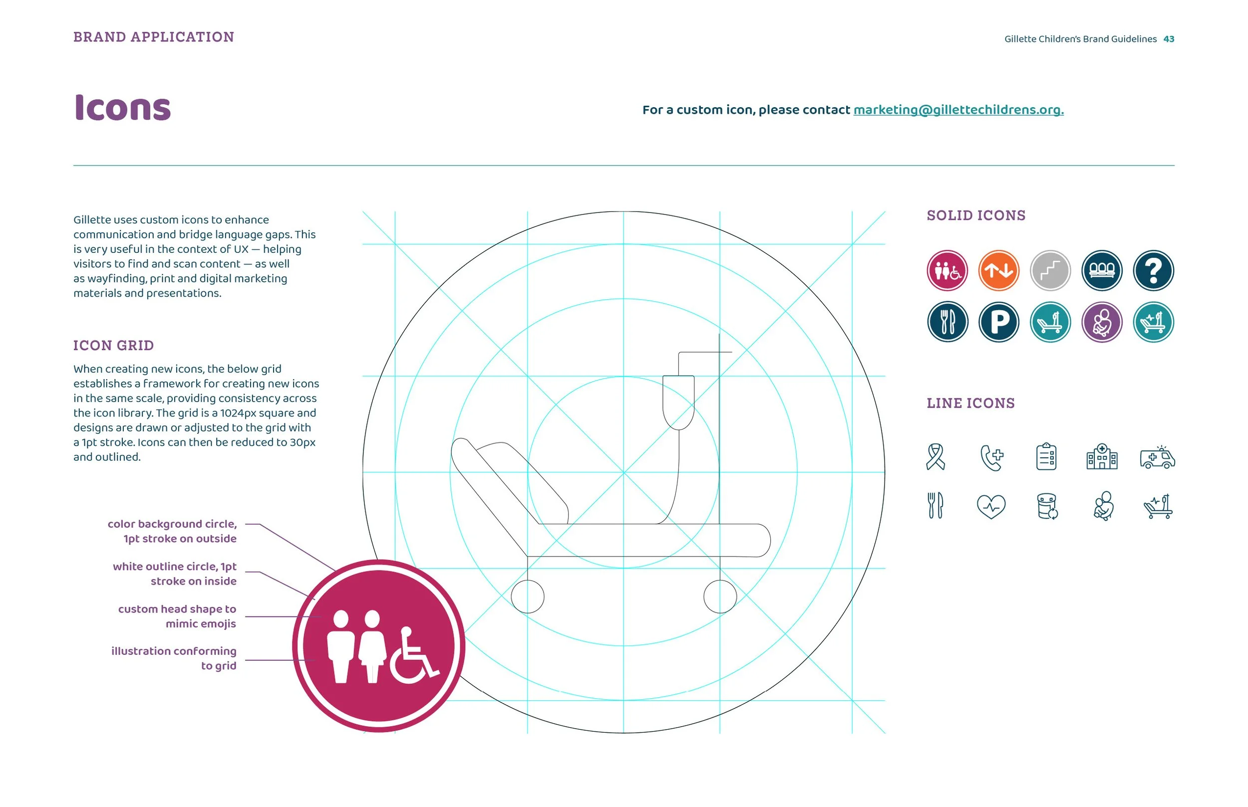
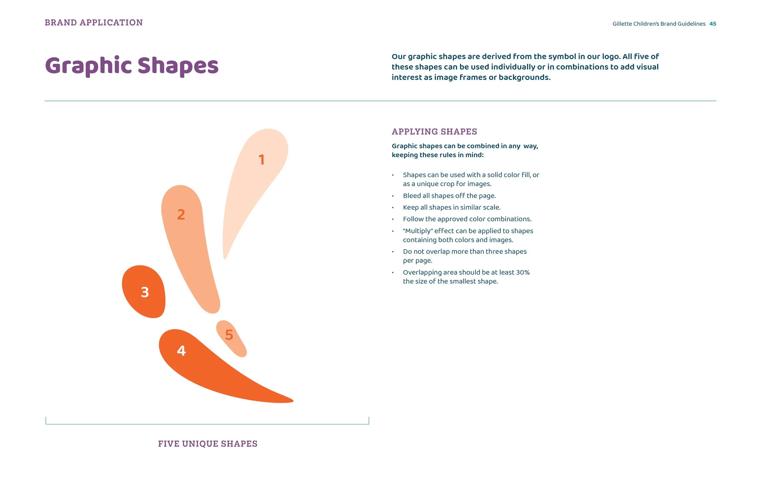
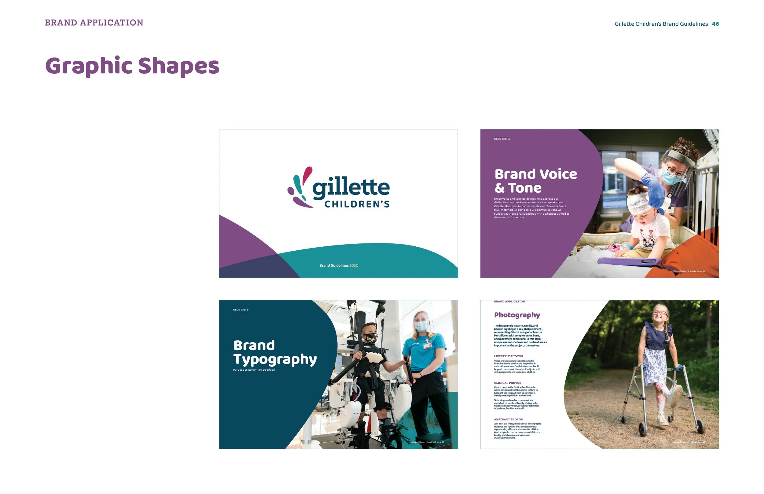
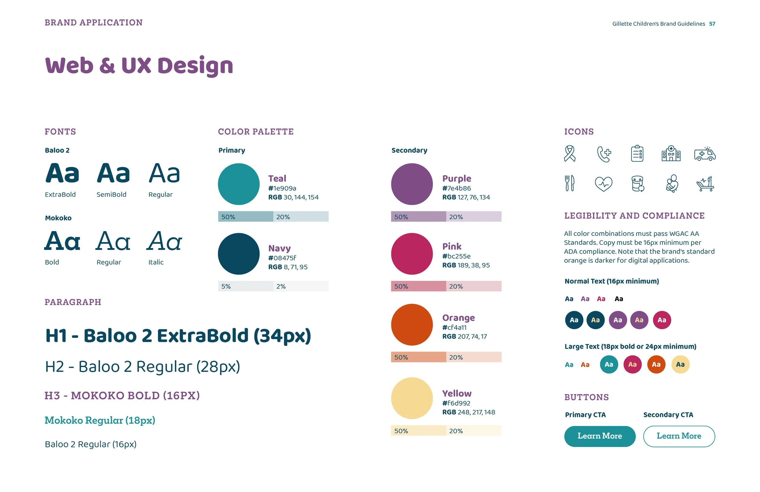
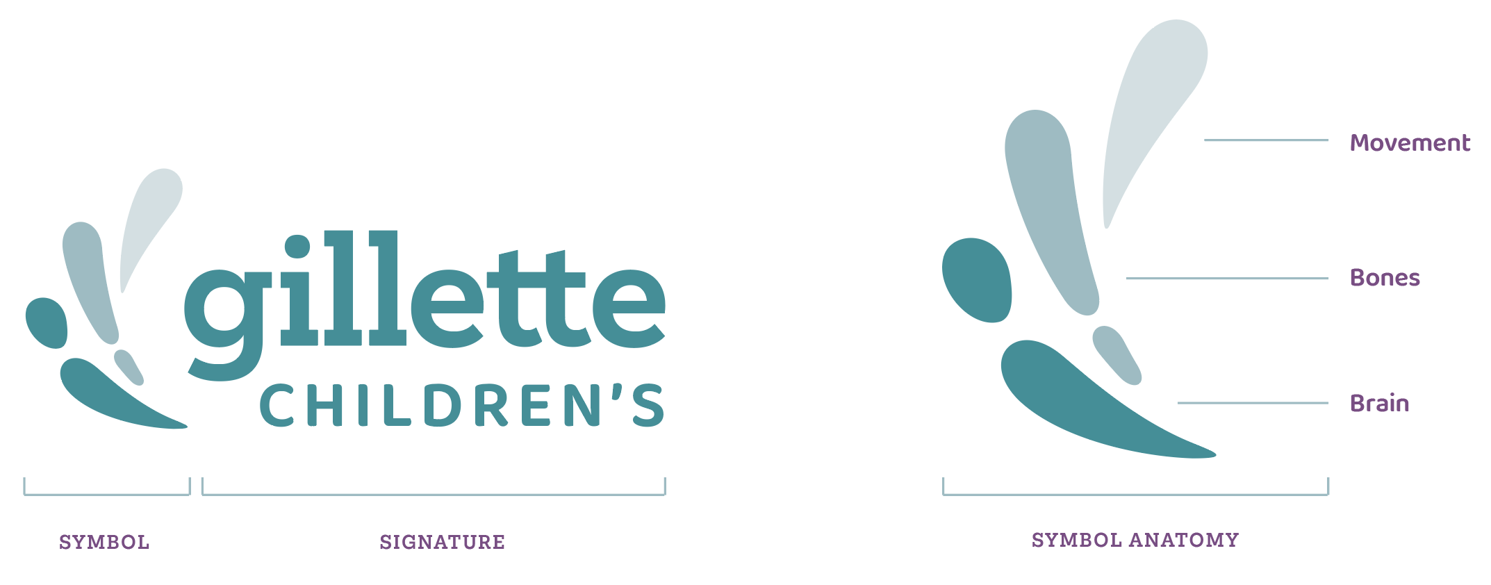
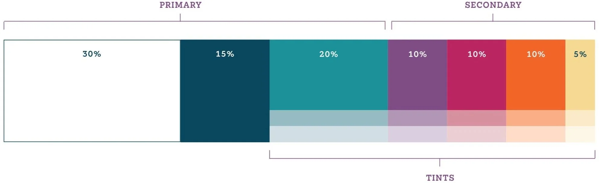
We built out the brand from the ground up, including the logo, color palette, typography, imagery, and supporting graphic elements. The system leans into a sense of movement and possibility—an idea rooted in Gillette’s focus on brain, bone, and movement conditions—while staying clear, accessible, and consistent across every touchpoint.
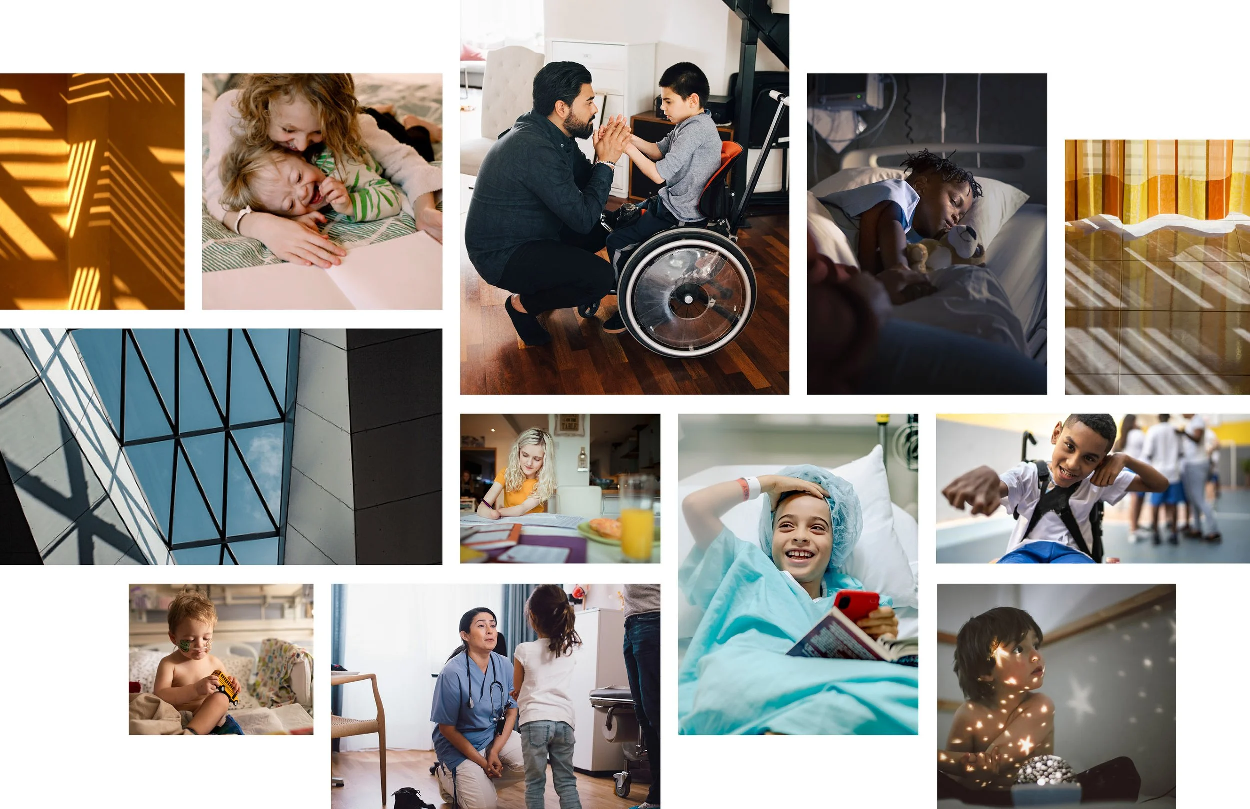
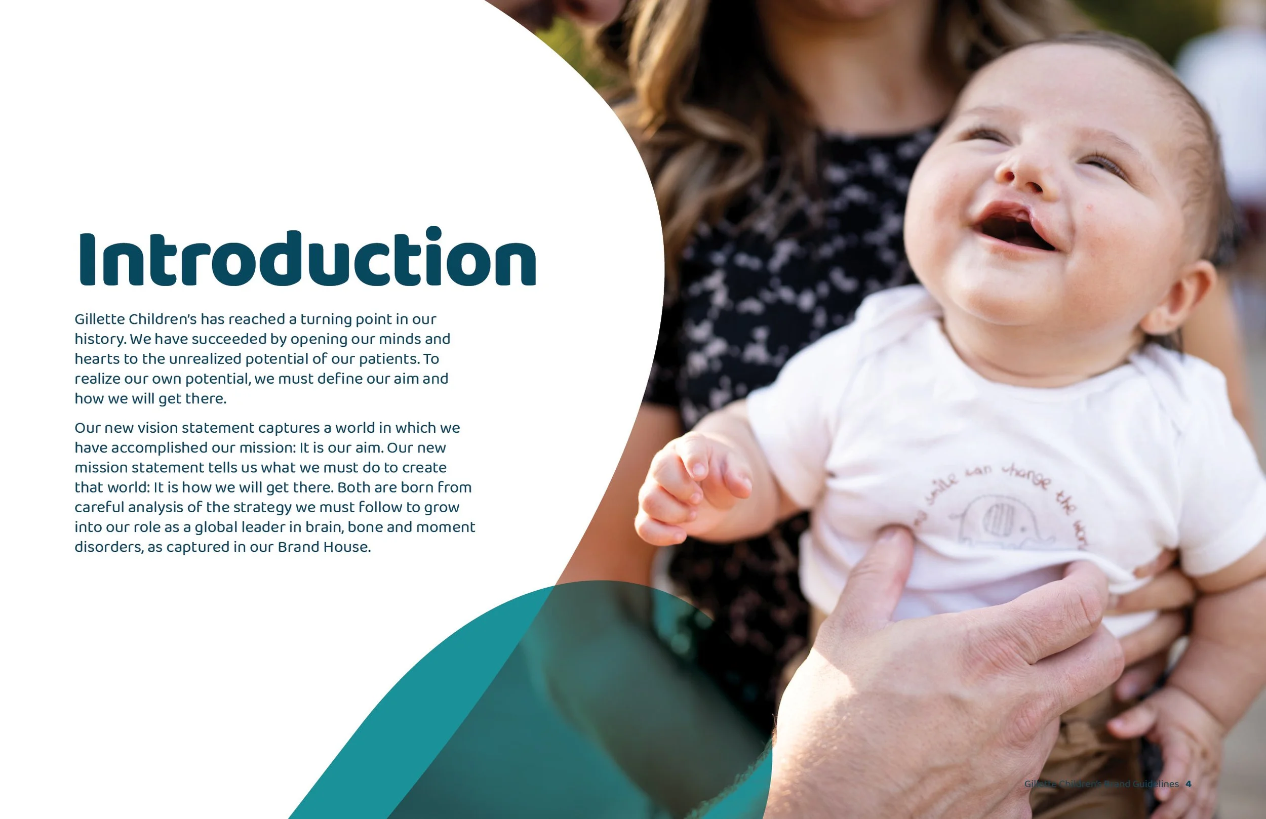
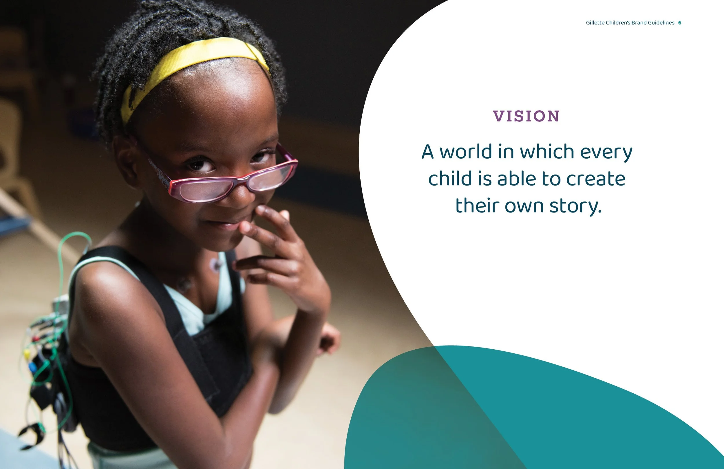
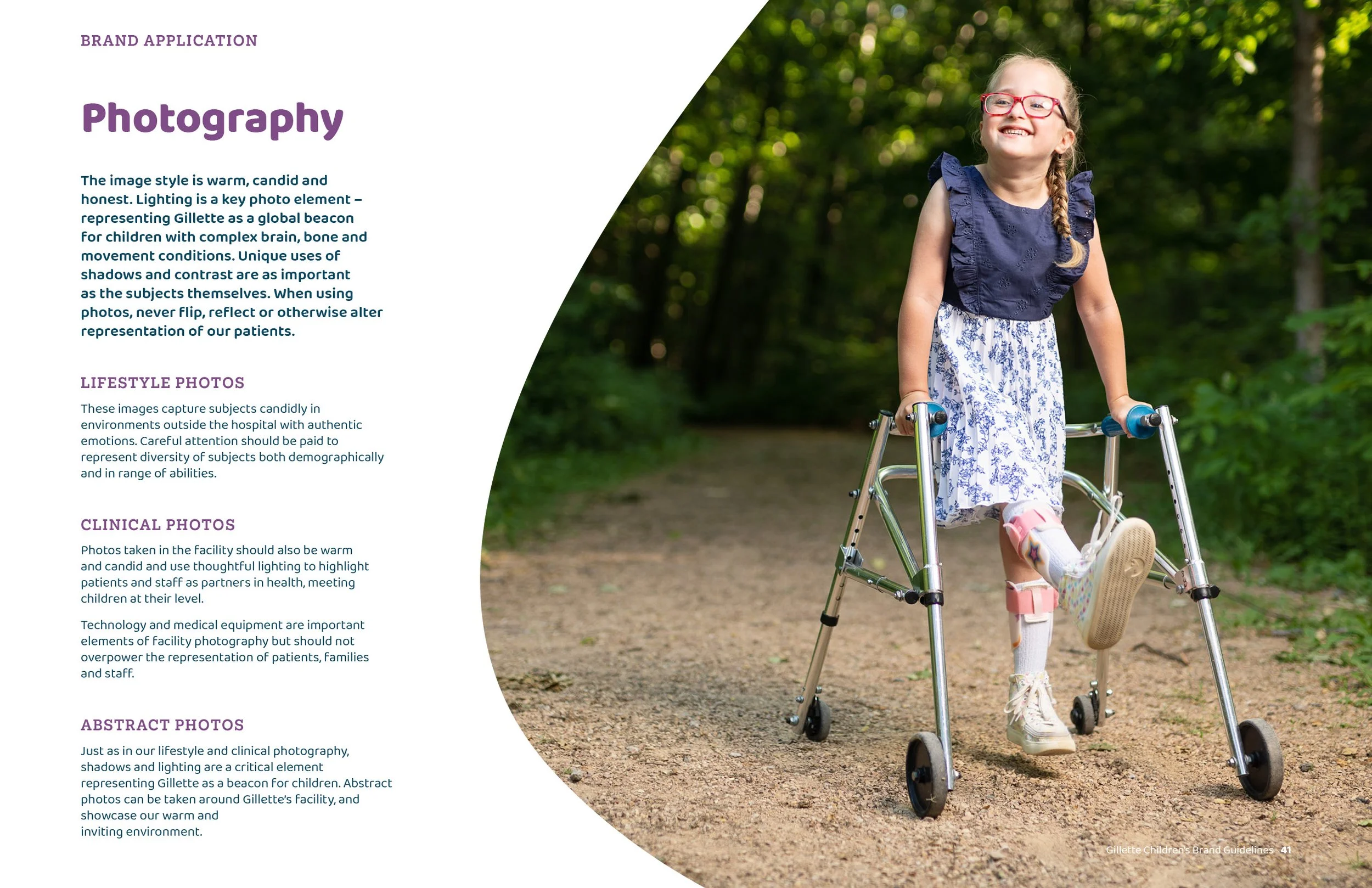
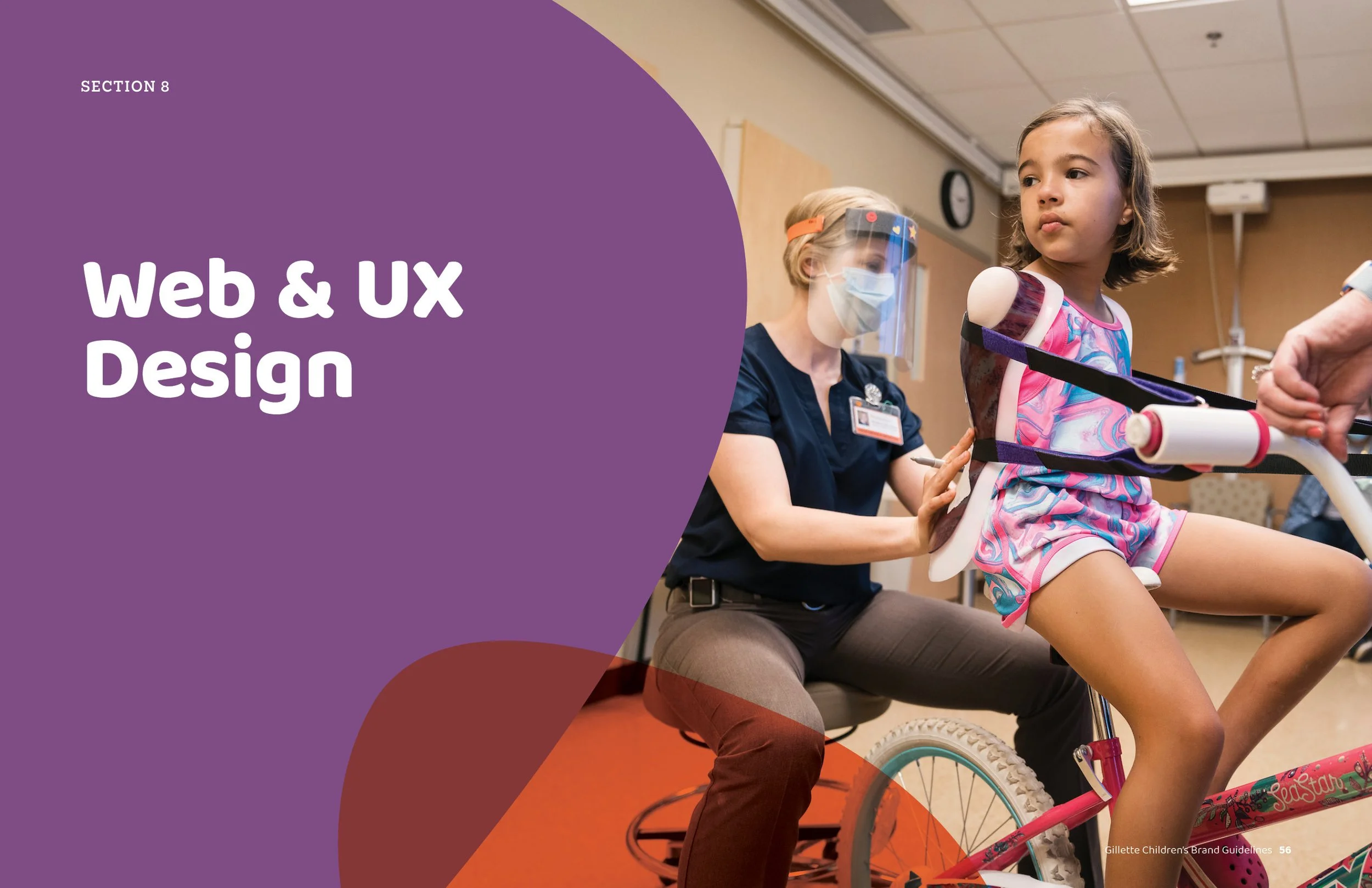
The visual language uses bold, vibrant color and organic forms to create a sense of energy and optimism. Candid, human-centered photography, features only their real patients and providers.
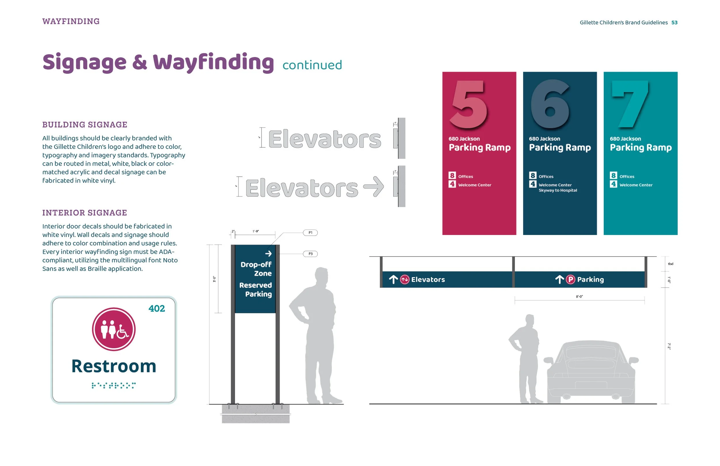
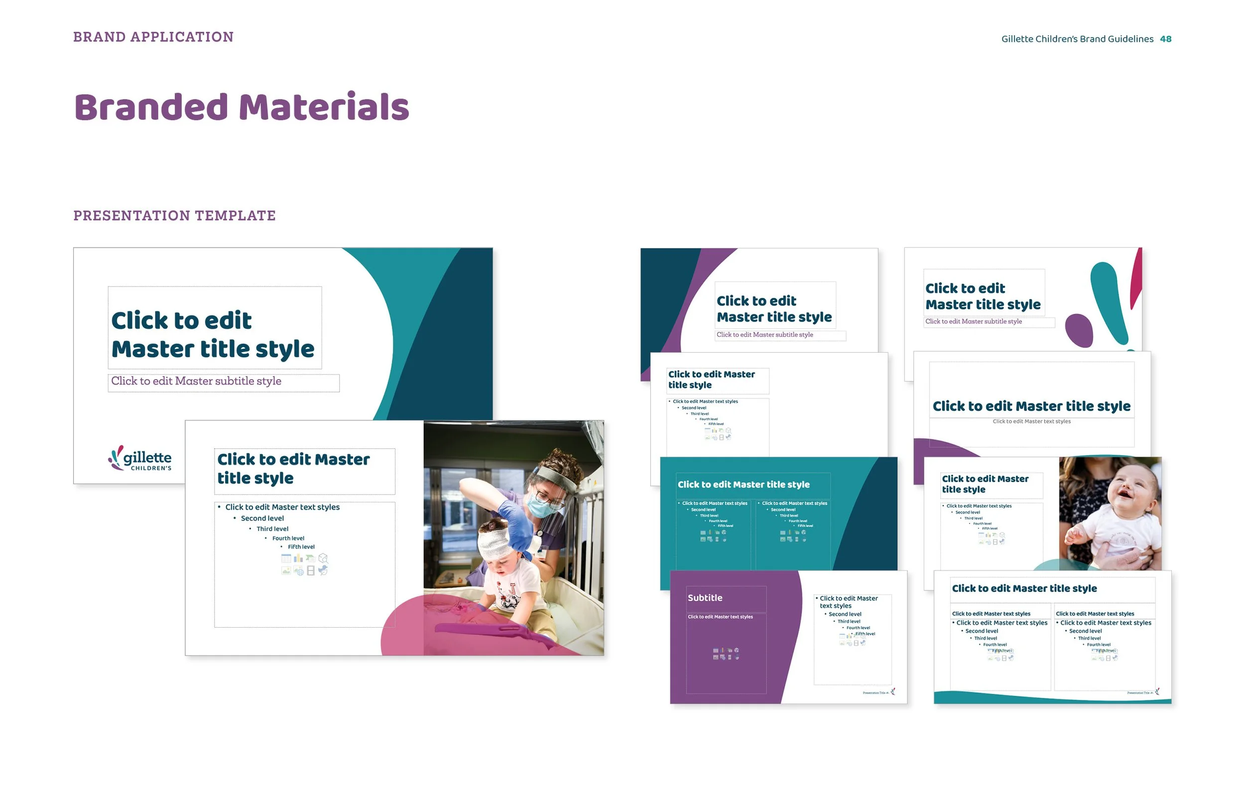
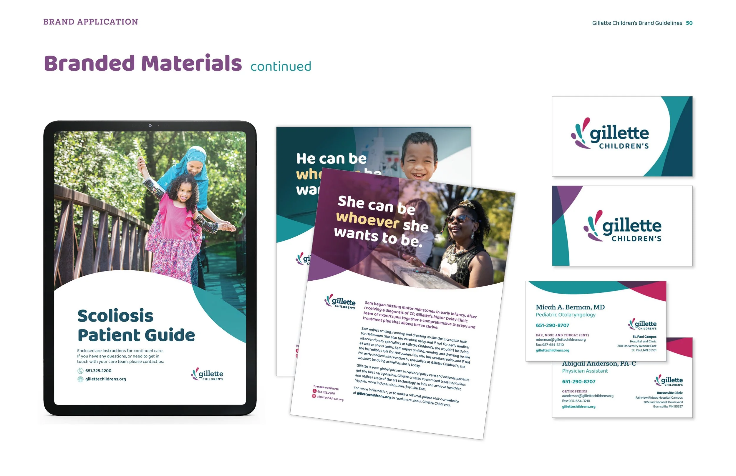
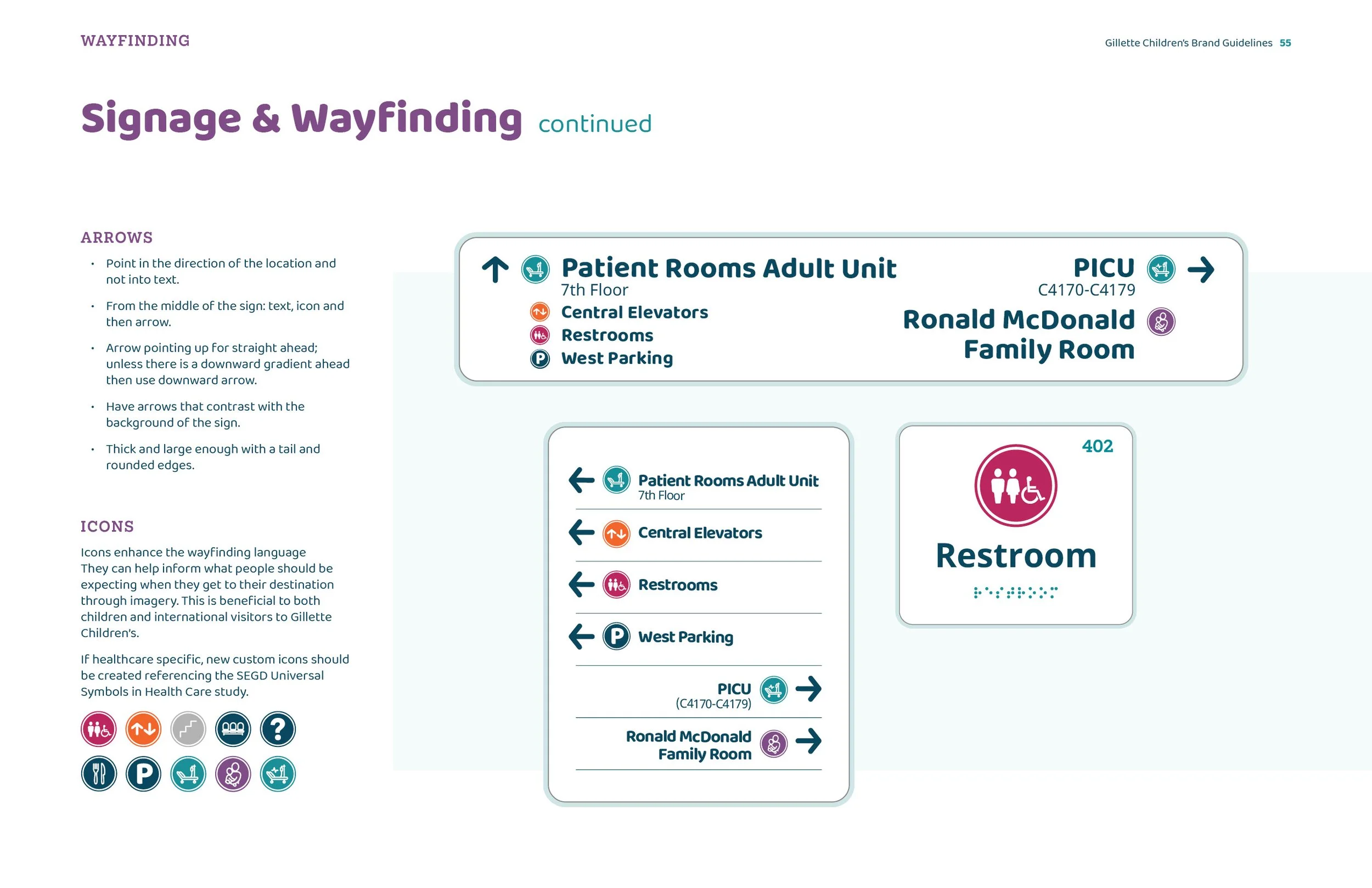
I also worked closely with the client’s internal teams to design a wide range of collateral, making sure it worked in practice, not just in the guidelines. From PowerPoint templates and stationery to wayfinding signage and environmental graphics, the goal was to build something clear, consistent, and flexible across all areas.
The result is an identity that reflects the world-class level of care they provide, while still feeling shaped and inspired by the kids at the center of it all.